
Thursday, 24 April 2014
Wednesday, 23 April 2014

Tuesday, 22 April 2014

Friday, 18 April 2014
Thursday, 17 April 2014
Wednesday, 16 April 2014
Tuesday, 15 April 2014
Monday, 14 April 2014
Friday, 4 April 2014
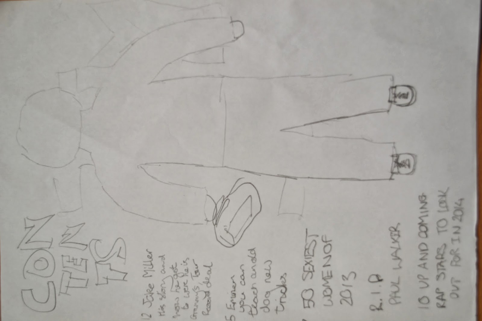
DPS Planning
I have chosen to use this first DPS that I have planned because of the use of the conventions and the layout of the magazine. It also manages to keep a consistent house style. The wanted expresses the raw element of the artist because of him being brand new into the industry. Furthermore, the use of the interview assemebled at different heights relates to steps that he has taken to get where he is.
 This is the other DPS I had planned that was in contention to be used for my magazine because of the consistent layout that makes use of the space on the page. The image is clear porspect of resemebling how the artist has a two sided life to him because of only being half on the page. Also the text that goes across the middle of the page diagonally above the interview gives the image of the genre being represented of the urbanisation in the genre.

Thursday, 3 April 2014
Producing a copy of a whole magazine cover-Planning


My copy of the real VIBE magazine cover could have been improved by: bring able to get a more accurate text to resemble the house style of the original magazine cover, been able to create a more precise masthead so it would look almost identical to the real one, and istead of using a medium long shot for my main image to instead actually use a medium close up and so to crop off most of the body. In my first attempt at trying to use this sftware I think I was able use the tools that were necessary to get my mock up front cover the way it is quite well. By learning these tools it will help me in using them when it comes to producing my own front cover.
Tuesday, 1 April 2014
Photo Analysis for my Front Cover-Planning


Friday, 28 March 2014
Audience Appeal-Planning
Target Audience
for Magazine
The target audience I aiming for my magazine is an age range
of 16+ that enjoy rap music because I want it to be interesting and informative
for the readers so they don’t get bored from reading it. Although the age range
specifies 16+ it could probably stretch maybe a few years younger but probably
not above the age of 40. I will successfully appeal to the target market with a
bold house style and colours that will attract the eye of consumers so there
will be a vast range of the public looking at buying the magazine. Also with
stories the public want to read about like upcoming artists and successful
musicians that in their prime at the moment, these would mostly be interviews
digging into the background of the artist. The gender focus is not specifically
one sided but instead just anyone who enjoys the music and wants to read about
it will buy the magazine, this would increase the wider popularity of the
magazine by not focusing on a specific gender. I would address the audience as
friend that I have known for a long time and always be positive because people
like to get away from the negativity in their life occasionally and indulge in
a story that makes them look on the positive side. The magazine VIBE has been a
massive influence in the how I have produced the magazine especially with the
house style and colours. The boldness of the font and colours make it stand out
from other magazines to buyers which I have taken on board for my magazine
because it is a very popular look that got VIBE recognition. Also it makes
everything stand out clearly from the contrast of the background with this
selection of colours to use. Also I have taken the way VIBE is designed as an
influence with the spacing between cover lines and the masthead, which has a
very solid and professional look to it. This is why I am trying to get
inspiration from VIBE because it’s a very popular magazine which keeps a
relaxed, casual mood which is what I want to try and do with my magazine.
Wednesday, 26 March 2014
Real Magazine Draft Ideas Front Cover and Contents - Planning
These are my magazine draft ideas that I have chosen to make my real cover and contents page. I am trying to achieve this by using software such as Photoshop to complete these pieces of work to their full potential. I decided to keep with the designs in the picture or similar to them because keeps to the minimalist style of magazine I wanted with alot of empty space and for the audience to concentrate on the image.

Photoshop Practises-Planning
My first attempts at using photoshop included some tests of copying different sell lines and then having a go at creating my own. This is the one I started off with:


My teacher set this example copy for me to have an attempt at, P Diddy and Felix. I tried to find the most accurate text to use that was similar to the original. Also I used the effects to make the accuracy of the sell line.
Tuesday, 25 March 2014
Draft Prelim Contents Page
I have attempted to make an effort on trying to make a magazine contents page in Microsoft Publisher.


When my making first draft of a contents page, I tried to include just the main contents to see how it came out like, and also attempted to keep the house style and colour scheme consistent to the rest of the magazine. I tried to keep to the layout style but it didn't come out too well. Although I couldn't have achieved thsi standard of quality in just a program such as Publisher but would instead need soething like Photoshop to get it anywhere close to looking like it. The use of the images on the pages are good because of the quality of them and where they are postitioned on the page. From the real magazine I imaged to establish the layout and imagery to put into my magazine although I haven't fully fulfilled the attempts there is still room for improvement on it.
When my making first draft of a contents page, I tried to include just the main contents to see how it came out like, and also attempted to keep the house style and colour scheme consistent to the rest of the magazine. I tried to keep to the layout style but it didn't come out too well. Although I couldn't have achieved thsi standard of quality in just a program such as Publisher but would instead need soething like Photoshop to get it anywhere close to looking like it. The use of the images on the pages are good because of the quality of them and where they are postitioned on the page. From the real magazine I imaged to establish the layout and imagery to put into my magazine although I haven't fully fulfilled the attempts there is still room for improvement on it.
Monday, 24 March 2014
Draft Prelim Mag Cover
I have created a draft magazine cover using microsoft publisher. I attempted this to see if I could make a magazine cover with the right conventions included.


The magazine cover on the right is an official VIBE magazine they released. In contrast my first attempt at a magazine cover was not as professional as this companies for obvious reasons. Although I tried to make all the cionventions of my front cover similar to the ones on the official. I managed to keep to specificall choose and house style and colour scheme for my magazine to have which is what VIBE have done brilliantly. Also by including the barcode with website and other various links to socila networking I have tried to make it look more like a professional magazine. Also I have been able to accomodate most of the conventions used such as cover lines, a main image, a puff and specifically a masthead.
Friday, 21 March 2014
DPS-Research
I decided analyse these dps' because these examples relate to what I want my double page spread to appear as at the end of the process.
Thursday, 20 March 2014
Magazine Survey-Research
This is my survey for my media coursework on what people look for in a magazine and what type people this genre of magazine. I targeted the audience I went for which was teens and used straight forward easy questions about the choices to make before producing the magazine. These results will help me make my decision on the design on the magazine and the final outcome.
Sunday, 16 March 2014
Music Magazine Analysis 2-Research
This is my analysis of my second music magazine cover VIBE.

It is a cover that is cluttered
with a range cover lines about what is inside the magazine.
They keep a certain house style and colour scheme in this magazine so they can
be recognised for who they are. They are bold and complimentary of each other
which ism often helpful because of what the competing genres are producing with
a range of colours on there cover. Although it is cluttered
there is clean and professional look to the cover with the arrangement of cover
lines and the masthead with there fonts sizes that give a certain edge to it.
It is cluttered on the front cover but it still gives off a vibe of
sophistication for the readers.
Saturday, 15 March 2014
Music Magazine Cover Analysis 1-Research
This is my analysis of my first music magazine cover which is JET.

Very spacious cover but puts the
main stories from the magazine out there. The colours are basic but bold and
make it stand out from every other magazine because there rivals in other
genres such as rock, normally use bright colours. Different font sizes sells
the magazine with the clean composed font that represents the professionalism
of the magazine. It is made for people that enjoy this genre but have
sophisticated way of thinking. Looks bland but the substance and use of a
enigma code by designers.
Friday, 14 March 2014
Thursday, 6 March 2014
What is a Music Magazine?-Research
What is a Music Magazine?
A music magazine is made up of information that is related to any genre of music, rap, pop, heavy metal, rock etc. It gains its profit in the market by targetuing a specific audience about the genre of music they enjoy and listen too. The different genres of music normally are owned by different publiction labels. A clear example of this is Bauer Media (Rock, Kerrang), IPC Media (Rock, NME) and Buzznet (Rap, VIBE).
The content included in music magazines usually consist of:
The idea is to appeal to the target audience so they want to read our magazine, they tend to go with brand recognition because they know what is going to be in it. This is why marketing is needed by the company so they are received as the brand by the readers.
Music Magazines frequently use promotional offers to draw in the readers by offering free downloads, albums or occasionally giving out free merchandise for a certain artist. They is shown when VIBE have offered free promotional tracks from a range of artists.
A music magazine is made up of information that is related to any genre of music, rap, pop, heavy metal, rock etc. It gains its profit in the market by targetuing a specific audience about the genre of music they enjoy and listen too. The different genres of music normally are owned by different publiction labels. A clear example of this is Bauer Media (Rock, Kerrang), IPC Media (Rock, NME) and Buzznet (Rap, VIBE).
The content included in music magazines usually consist of:
- Interviews
- Photo Shoots
- Music and Concert Reviews
- Rankings/Countdowns
- Quiz Pages
- Lyrics
- Fan Forum Page
- Gossip Column
- Promotional Offers
The idea is to appeal to the target audience so they want to read our magazine, they tend to go with brand recognition because they know what is going to be in it. This is why marketing is needed by the company so they are received as the brand by the readers.
Music Magazines frequently use promotional offers to draw in the readers by offering free downloads, albums or occasionally giving out free merchandise for a certain artist. They is shown when VIBE have offered free promotional tracks from a range of artists.
Wednesday, 5 March 2014
Research of Magazine Institution-Research
This is my research on a magazine institution which is Buzznet and a timeline of important events in there history.
Tuesday, 4 March 2014
Introduction
This is my media studies blog, where I will upload all my work over the course. It will include various pieces of work that will be included in the course. This includes all the research and planning I am including in my course. Then I will be uploading all the work for the construction of my magazine front cover, contents and double page spread. Then finally it will have my uploaded evaluation with the use of presentation software of my magazine that has been constructed.
Subscribe to:
Comments (Atom)